Stop Aggregating Away the Signal
Published on Stack Overflow's blog, this article shows how "by aggregating our data in an effort to simplify it, we lose the signal and the context we need to make sense of what we’re seeing."


Visualizing Data for Analysis & Decision Making
I create charts and graphs which change how people look at their data (literally). My focus on data viz for analysis leads to better decision making, data driven questions, deeper understanding, and new discoveries.
My charts have been used by CEOs and SVPs in tech, the Dalai Lama, researchers at Google, scientists at Yale, Stanford, and UC Berkeley, public health officials in California and the CDC, and informed the White House's response to the mPox crisis. My work has been published by Scientific American, on the AI research platform Distill.pub, and exhibited at SF MOMA, Ars Electronica, and Cooper Hewitt.
I've taught Design of Data at Stanford's d.school, published viz research, mentored the ACLU's viz specialist, and spoken at OpenVisConf, Outlier, InfoPlus, IEEE Viz, SciPy, and JSM. My analytical perspective is grounded in my prior work as a Senior Financial Analyst at Google.
These articles/talks show how I approach creating charts and how I think about data. If you like these, you'll like working with me.
Published on Stack Overflow's blog, this article shows how "by aggregating our data in an effort to simplify it, we lose the signal and the context we need to make sense of what we’re seeing."
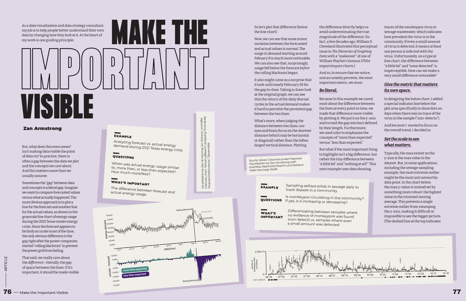
Published in the "Guidelines" issue of the Data Visualization's Nightingale Magazine, this article shows readers how to make more effective data visualizations by ensuring that "whatever is most important about their data" is actually made literally visible in some way. It's not as obvious as it seems, but when applied it is extremely powerful.
This talk expands the classic explore/explain paradigm of data viz by adding "diagnostic charts", the charts you use again and again each time you have new data come in. Discover how focusing on the questions you need answered can make your data visualizations more effective and impactful.
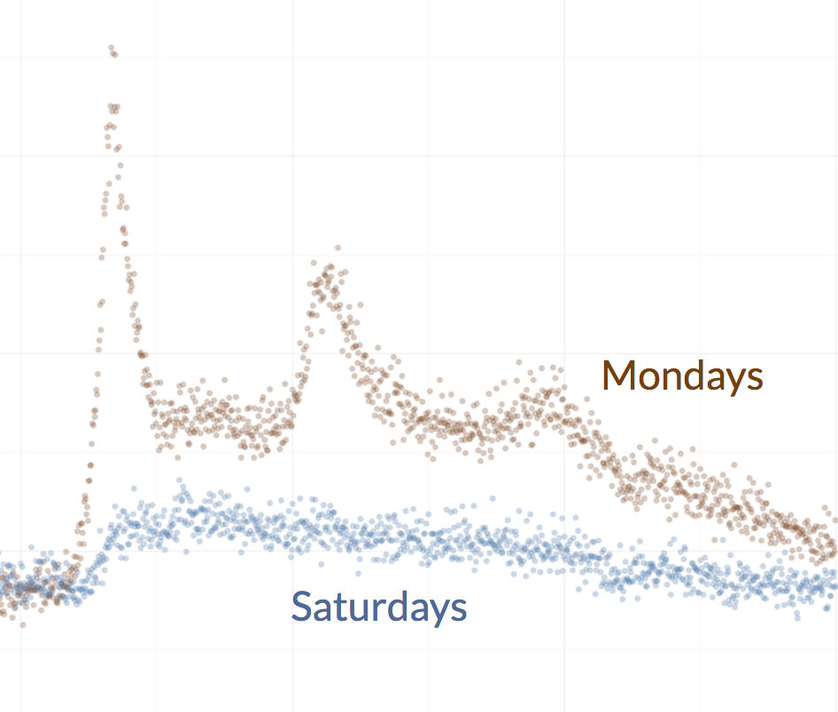
In this talk you'll learn why your commute is worse in November than June, why so many babies are born around 8:30am, and why it's almost always a terrible idea to look at monthly data.
Why are So Many Babies Born Around 8am
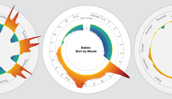
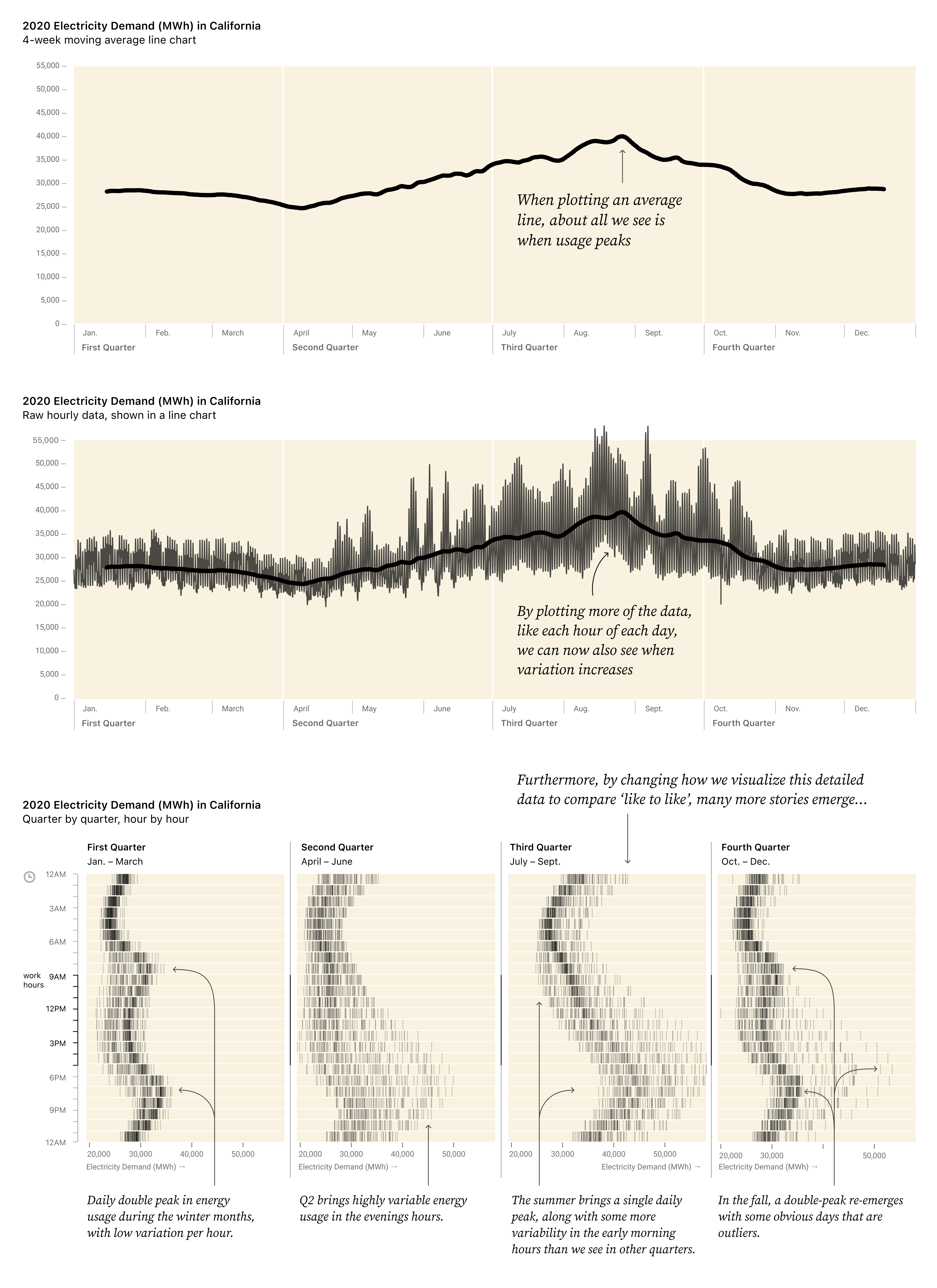
It is common to aggregate data over time when striving for simplicity, but sometimes the story is revealed in the details: minutes, hours, days, and weeks.
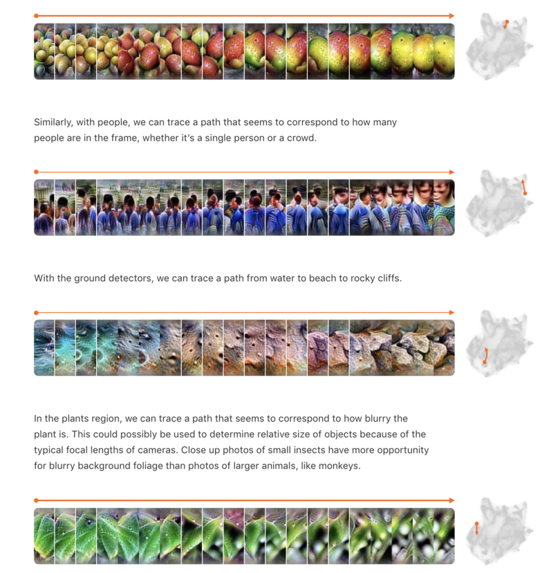
The Activation Atlas helps us see through the eyes of a model, not just how it responds to a specific input but to provide a map of what is "seeable" at each layer. This work was led by Shan Carter; I contributed to the interactives and analysis.
Published on AI research's Distill.pub, and exhibited in Ars Electronica's Understanding AI exhibit.
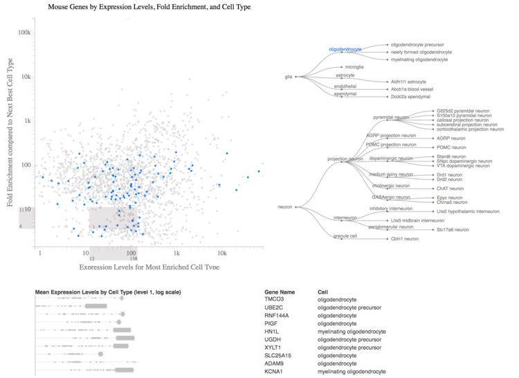
Metagenomics
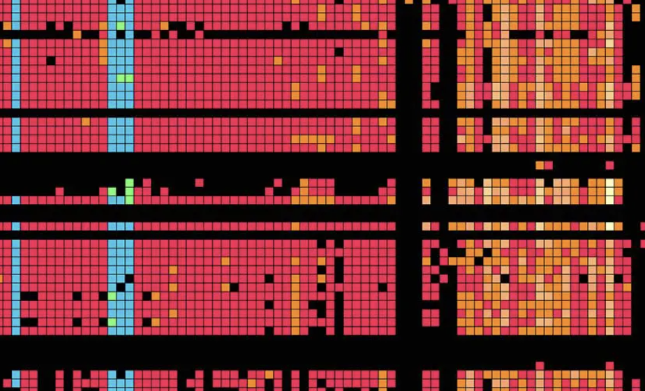
Originally created for researchers at UC Berkeley to study the genetics of micro-ecosystems like the gut of an infant, the inside of a nuclear reactor, or between a dolphin's teeth, this visualization was also embraced by the art & design community.
My favorite part were the bold colors. They met a scientific need: despite being close numerically, the values 0 and 1 were shown in black and bright colors, respectively, due to the scientific context that "none" and "at least 1" were conceptual opposites.
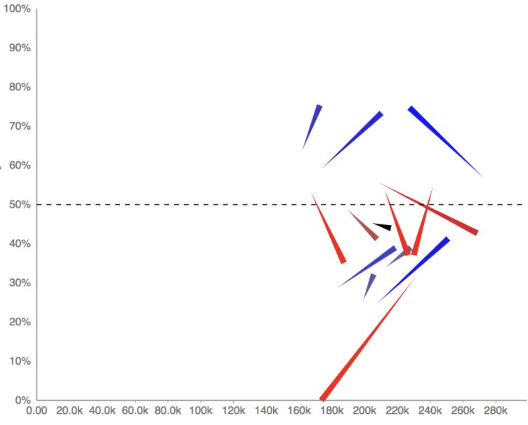
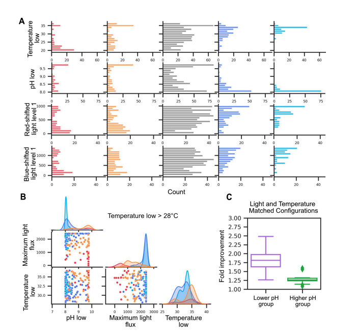
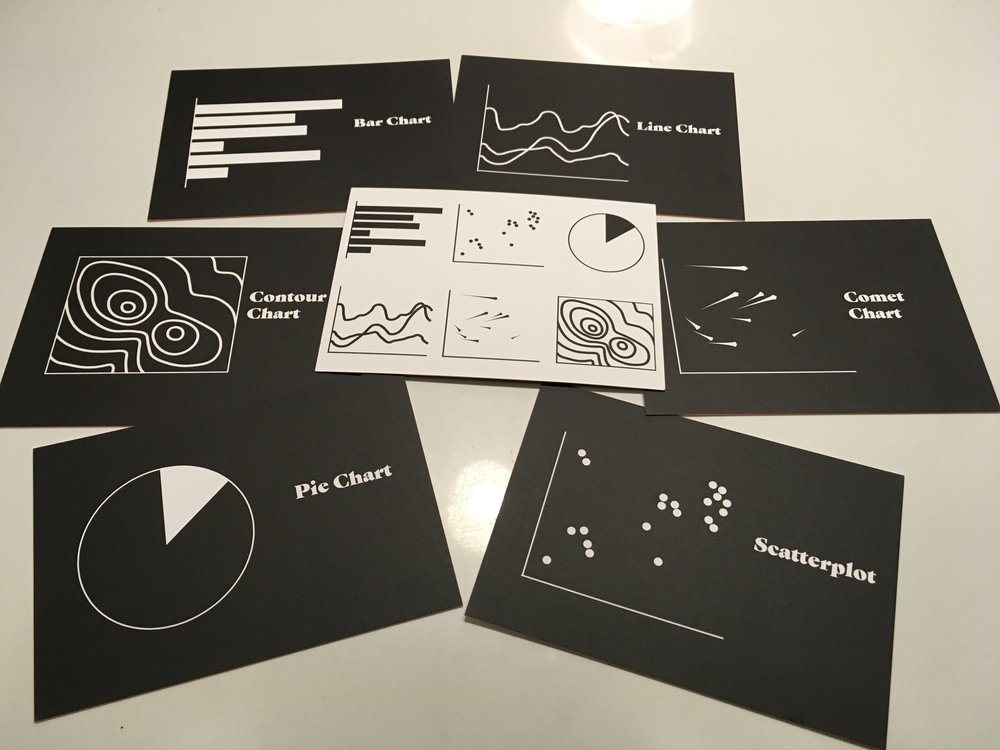
Simpson's Paradox is an extreme version of a notoriously confusing effect in which aggregate numbers seem to contradict more detailed statistics. A "comet chart" is a special type of scatterplot to reveal "changes in mix". In addition to showing the metric of interest on the y-axis, it also shows the size of each subgroup on the x-axis. It's immediately obvious if comets are all "streaking together", going all different directions, or if there is some correlation between where the comets are spatially and how they are changing.
Visualizing Mix Effects and Simpson's Paradox, in collaboration with Martin Wattenberg
Comet Chart & Gerrymandering: Slides
Created by student Sarah Ann Li-Shen Teaw
In collaboration with Catherine Madden and Irene Alisjahbana, I taught a 10 week course in Stanford's d.school in fall 2024. Our students included both undergraduate and graduate students.
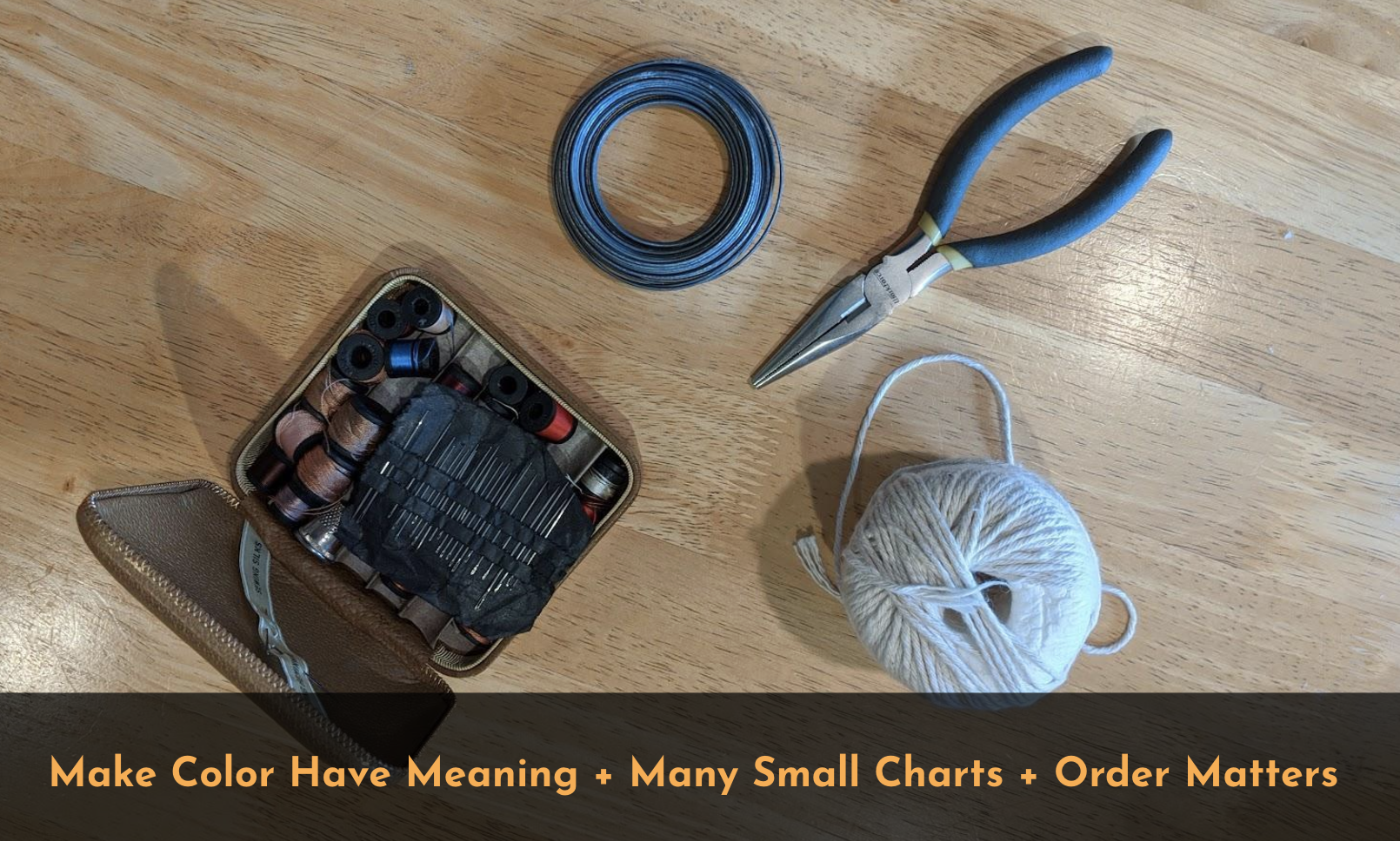
This talk introduces the three simple, flexible "tools" of data visualization: making color meaningful, using small multiples, and making order matter. Furthermore, it shows *why* these tools are so powerful to reveal information that might have been visible, but not noticeable or attention-grabbing. Most importantly, it demonstrates how practioners can use these principles to bring their own domain expertise or understanding of the question into their visualizations, and to make their implicit assumptions explicit.
While some data visualization specialists are focused on effective communication and storytelling with data, much of my work is aimed at helping domain experts better use data to inform decisions or make new discoveries. For example, as a member of the Google Applied Science team I contributed to research on drug discovery, materials science, automating insight from biological images, fusion, improving scientific computing with machine learning, and more. While I sometimes consulted on scientific communication, my focus was not about communicating results. Rather, it was about working with the scientists during the discovery and analysis process: advising, prototyping, performing viz-based analysis, and building analysis tools. Success was defined as visualizations changing the scientific decisions (which model is chosen, what experiment to perform, how to change experimental conditions, etc.), directly leading to a discovery, or using scientific data to inform a "real-world" decision.
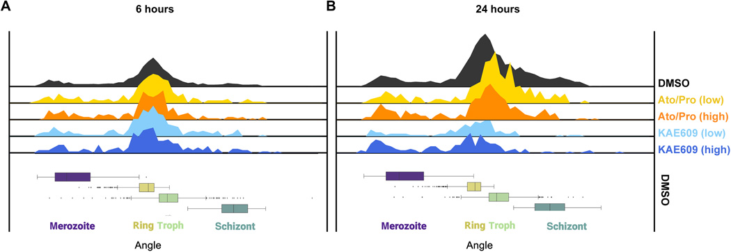
Over the course of three years, I worked closely with scientists and ML experts as they built models to create new methods in the effort to find new anti-malarial drugs.
In the scientific context, authorship is reserved for contributions to the scientific results. So, my inclusion as an contributing author indicates the critical role visualization played in this work.
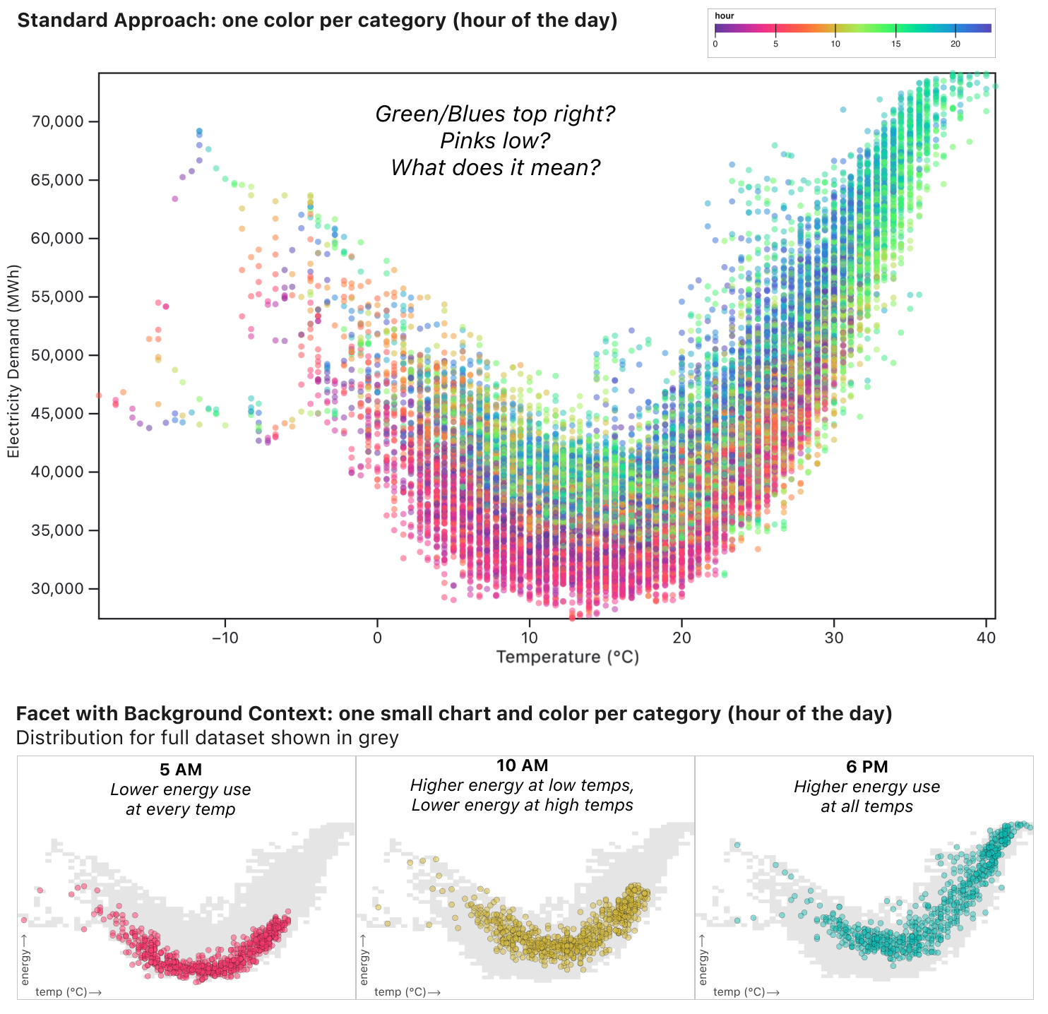
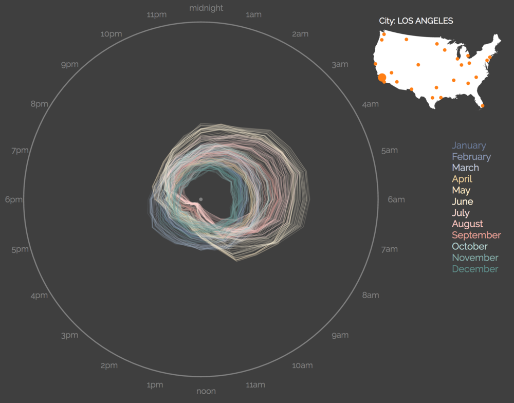
At Observable, I led this project to illustrate how we can literally change how we look at our data to more effectively analyze data heavily influenced by hour-of-day, day-of-week, and season-of-year patterns. This work was done in collaboration with Ian Johnson and Mike Freeman. Through a series of 6 "stories" we showcase techniques that can be applied to any dataset with values measured each hour or day.
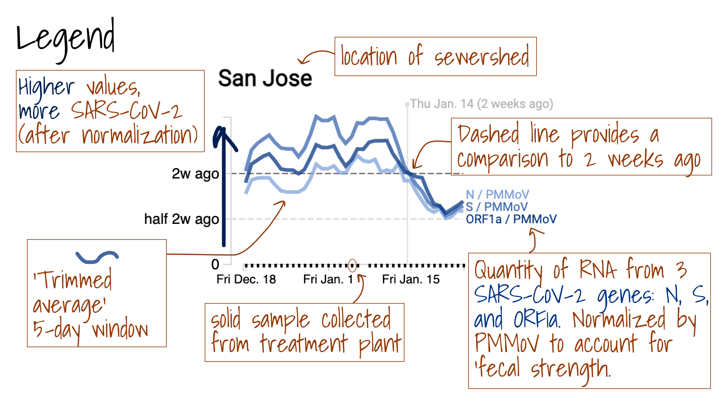
When infected with a disease, we poop fragments of the viral RNA. Sampling sewage and isolating/sequencing the extracted genes therefore provides unique insight into community-level transmission of infectious diseases, including Covid-19. Because "everybody contributes" their poop to the sewage system, tracking viral fragments in wastewater provides data that doesn't rely on individual people going to doctors to get official tests.
This LA Times article demonstrates the impact that this data has already had on the decisions of public health officials and of doctors making decisions about which drugs they should use to treat patients based on which variant is predominant.
My work is not just about specific charts, but also about identifying new best practices and changing how researchers think about using viz more effectively in their own work.
"That was probably one of the most valuable hours that I spent in my entire time at [Google] X, completely shifted my thinking on how I do figures and what is important. Zan's skillset is unique in my experience."
- Sylvia Smullin - Physicist and ML Researcher
The design emphasized the importance of the two features that made this dataset special: quantitative accuracy and gene expression assayed by cell type.
This visualization played a role in the analysis leading to A multiregional proteomic survey of the postnatal human brain published in Nature Neuroscience
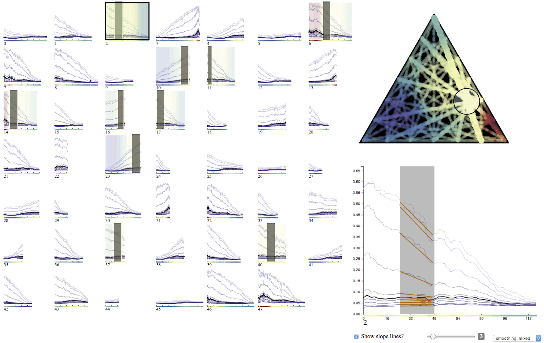
My first attempt was a beautiful, interactive 3D surface. Unfortunately, it was useless for analyzing the data. Instead, these 48 line charts show 10x more data and focused attention on the most important attributes of the data. Most importantly, the tool informed key research decisions and led to discovering an unexpected scientific phenomenon.
My contributions led to being an author in scientific research published in Proceedings of the National Academy of Sciences (PNAS), the world's second most cited scientific journal.
Discovery of complex oxides via automated experiments and data science
A common problem in ML is understanding the interconnected relationships between 3 to 20 potential features in a dataset to identify what combinations of features most affect a "score" variable. My key data visualization insight was identifying that if we discretized the continuous score function into "bad, meh, good, better, and best" categories we could much more effectively use color and small multiples to scan the space of pairwise interactions. This was especially important in this study where the ML algorithms informed growing conditions for algae, so measuring the effectiveness of a particular set of parameters was costly and time-consuming because it required actually growing the algae in the lab.
While my primary role on the Applied Sciences team was creating visualizations for analysis & discovery, I also advised researchers across the team on how to more effectively communicate their results.
The "curse of knowledge" bias is especially challenging in transitioning from analysis to communication: once you know what's important about the data in the chart, it's hard to imagine that someone else looking at the same chart wouldn't see the same thing.
Optimization of Molecules via Deep Reinforcement Learning
A Bayesian experimental autonomous researcher for mechanical design.
Machine learning on DNA-encoded libraries: A new paradigm for hit-finding
Quantum Optimization with a Novel Gibbs Objective Function and Ansatz Architecture Search
Investigating Quantum Approximate Optimization Algorithms under Bang-bang Protocols
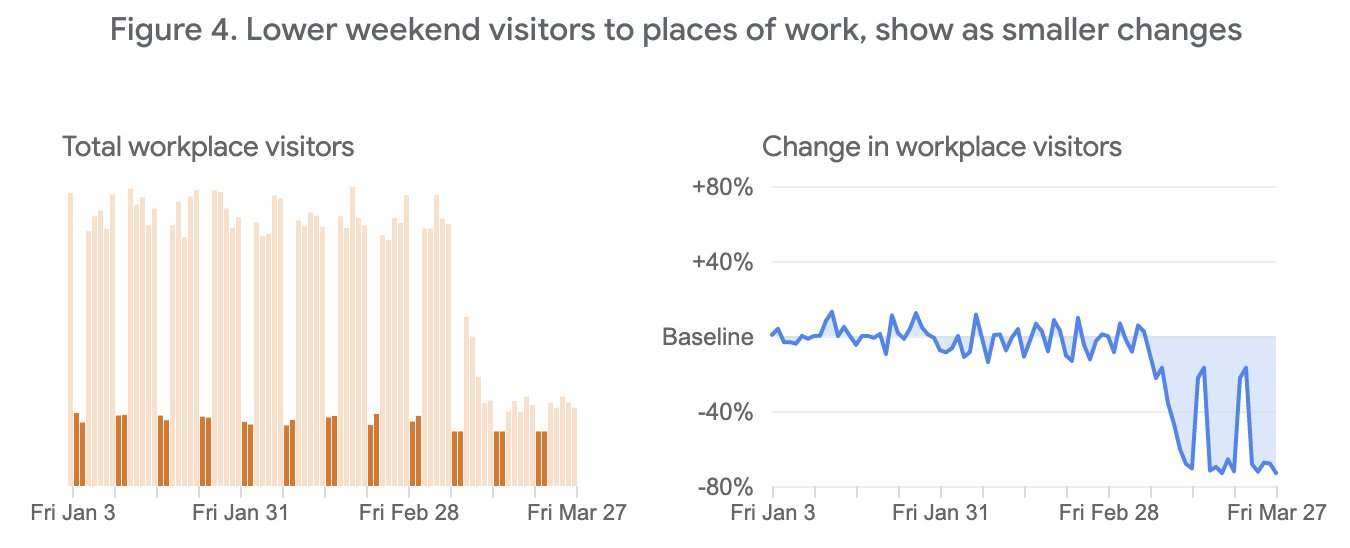
In March or 2020, I founded and led the Data Viz Hub: a group of Googlers with data viz skills lending their expertise to projects across Google related to Covid-19. For example, our group contributed to the Google Search and News teams' visualizations of covid statistics.
Additionally, Adam Pearce and I collaborated to create visualizations and thought questions to contextualize the data in the Google's Community Mobility Reports.
I lost a bet, but made a fun viz. It is colder in January than June in San Francisco, every single hour of the day.
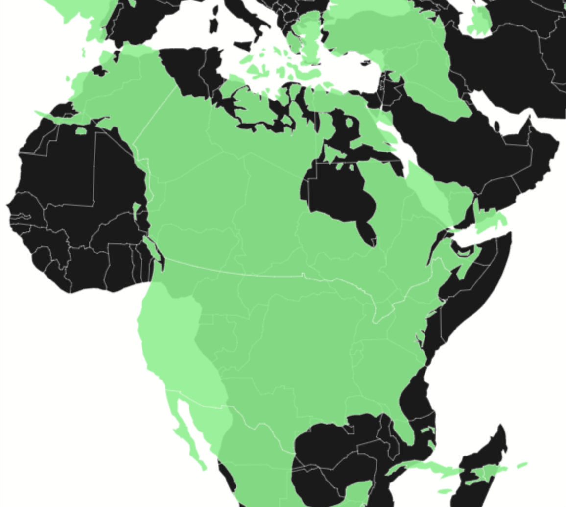
Everyone who's watched West Wing knows that Greenland is not as big as it seems in mercator projections. But, do you have a good intuition for the relative sizes of Saudi Arabia vs. Alaska or Europe vs. Antarctica?
Young babies love looking at high contrast cards, and the designs make viz-loving new parents smile.
Invited speaker for Rice University's 2025 Visual Communication Symposium
Keynote speaker for Google's global quantative user experience conference
SciPy Conference: Data Visualization for Scientific Analysis, featured on the Storytelling with Data podcast Right Place, Right Graph
Joint Statistical Meeting (JSM): Recent Advances in Information Visualization panel
University of Washington's eSciences Seminar Series - Distinguished Speaker
Moss Landing Marine Labs Seminar Series: Same Data, Different Forms
Panel Discussion with Kerry Rodden and Kai Chang on Creating Custom, but Generalizable, Charts
Maryland Institute College of Art's graduate program in Data Visualization
AI for ALL
USF Digital Literacy Course
TechChange Technology for Data Visualization
UC Davis SIAM Mathematics in Industry Speaker Series
Stanford's d.school: taught 10-week "Design of Data" course
Pro bono consulting for ACLU.
Intro to Data Visualization for CS teachers in the SF Public School system.
Guest teacher at Lowell High School, Lick-Wilmerding High School, Burton High School, AP Giannini Middle School, and BB&N Lower School.
Drawing with Data Workshop
Bay Area D3 Meetups including "Math to D3" talk.
Stamen Practitioners Series: A Conversation with Zan Armstrong
Jon Schwabish's Policy Viz Podcast
Scott Murray's Interactive Data Visualization for the Web
Ian Johnson's: How do you learn D3.js
You can reach me by email.